
Pantone’s 2026 Wedding Trend: Cloud Dancer
Creative ways to use Pantone’s 2026 Color of the Year Cloud Dancer in your wedding attire, floral
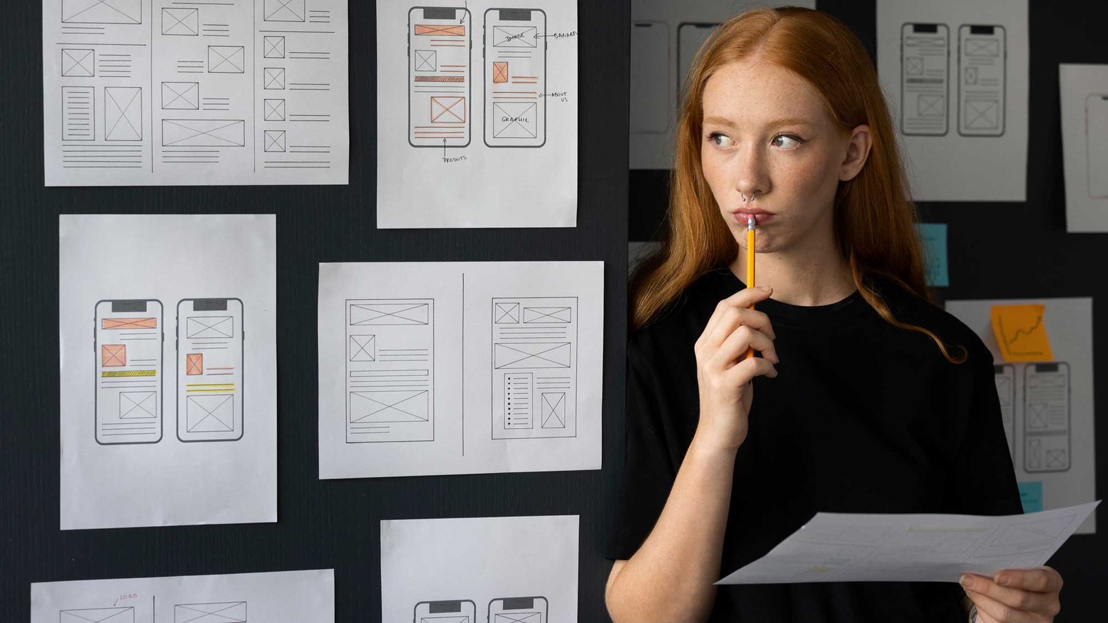
A pretty website isn’t always a working website. If you’re a wedding planner, stationer, or photographer, your site is your #1 salesperson. But most vendors unknowingly make mistakes that lead to fewer inquiries even if their work is stunning.
Let’s fix that.
Many wedding vendors try to say everything at once: what they do, who they are, what they believe, what services they offer, all crammed into one homepage. The result? Visitors get overwhelmed and click away before taking action.
This becomes a problem because when people land on your site, they should know in seconds who you are, what you offer, and what to do next. If your layout is messy, they’ll assume your process is too.
To fix it, just simplify your homepage. Use clear hierarchy (big headline, short supporting copy, single CTA). Guide your visitor’s eye down the page with strategic sections like an invitation, not a brochure.
Our tip: A clear call-to-action (“Inquire Now” or “See Portfolio”) should be visible above the fold always.
Your brand is more than a logo. A cookie-cutter website doesn’t capture the warmth, care, or creativity you bring to your work, and in the wedding industry, that emotional connection is everything.
When your site feels generic, it’s harder for potential clients to feel excited or trust that you’re the one. They’ll keep shopping around.
To solve this problem, Infuse your copy, visuals, and layout with your personality. Use storytelling in your About page. Show behind-the-scenes details, process steps, or even a note from you. Remember, you’re not a product, you’re a creative partner.
Our Tip: Use real client stories or your design philosophy to bring depth. Personality builds connection. Connection builds trust.
If your services, pricing, or contact button are buried three clicks deep, you’re losing people. Couples are planning under pressure. They don’t have time to hunt for info.
If a user can’t find what they’re looking for within 5 seconds, they bounce and book someone else. And this is not a reflection of your talent, it’s just poor usability.
To fix this issue, create a clean menu. Add quick links in your footer. Make your most important info, like packages or contact super easy to find. Use buttons, not just text links.
Our Tip: Put yourself in your client’s shoes. Ask, “What would I need to see to feel confident reaching out?”
You don’t need a total rebrand to make your site better. Just fixing these 3 mistakes can increase your bookings and improve your client experience. And when your website is aligned with your brand, pricing, and process, selling feels natural.
Want a website that works as beautifully as your portfolio looks? Romantik Type offers bespoke branding and web design for wedding creatives.
Creative ways to use Pantone’s 2026 Color of the Year Cloud Dancer in your wedding attire, floral
Feel like your brand is always in the backseat? If you’re a wedding videographer or DJ, it’s